There has been a fair amount of discussion and research in the last few years examining the use of different type fonts to help people with dyslexia read better. A recent example comes from a Dutch [Hurrah for the Dutch! That’s my nationality!!] designer with dyslexia, Christian Boer, who developed “Dyslexie” and is making it available free of charge to home users who would like to download it. Here is a description: To avoid confusion, Boer designed letters that have a heavier bottom half, making it less likely that a reader might flip them. He also made some openings larger, and slightly tilted some letters that closely resemble others — such as a “b” and a “d.” He also incorporates more space between the letters. You can learn more by going to this link:
Foreign Languages for Everyone
Irene Konyndyk's Website for Teaching a Second Language to Students with Learning Disabilities
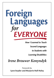
Irene Konyndyk

Get smart with the Thesis WordPress Theme from DIYthemes.
 follow:
- RSS